Chicken Nuggies B)

Chicken Nuggies B)

Tuesday, February 18, 2014

El Guapo


Hola, this is my completed El Guapo. The label has many unique aspects to it, such as the transparent hand-drawn sketches of the peppers. The flavor is my handwriting using a standard paintbrush. The El Guapo font, as well as the slogan and hashtag, are not impact (because that font is unaCCEPTABLLLEEE!!) but they are something very close (Haettenscweiler). I color the icons according to the colors of the four sauces. The slogan behind the bottle is supposed to have the appearance that it's being blurred because it's behind the glass.

Thursday, February 6, 2014

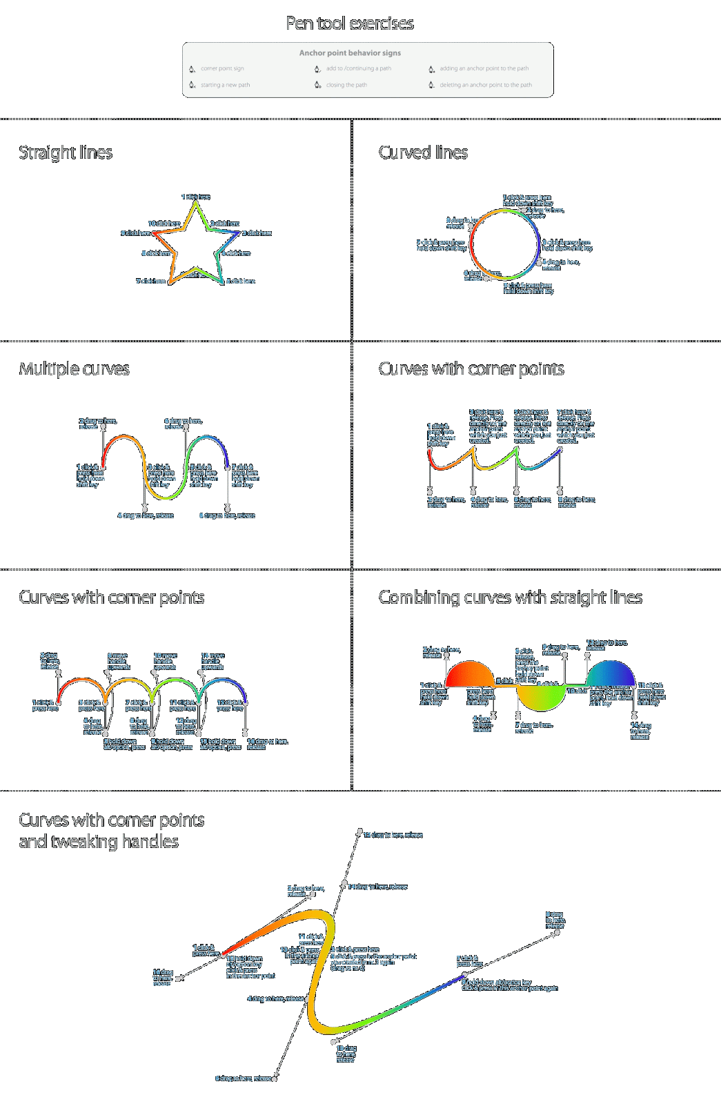
Pentool Exercise


I HATE strongly dislike the pen tool.
Though difficult, this was a good refresher. The final swoosh made me terribly upset. I asked myself, why? Why would MR.COLE WANT TO WATCH US STRUGGLE? But then I calmed down and bucked up and just did the swoosh. I almost died. It was a near-death experience, I'm not fibbing. The rainbows got nme through this.

Wednesday, January 29, 2014

30 Years Of Macintosh

Upon seeing the Helvetica documentary, I was inspired. Though a bit ridiculous, I was impressed by everything I saw, and the harmony of retro and modern (a design favorite of mine to begin with) that Helvetica portrayed--well, needless to say, it was beyond enticing. This project was a favorite of mine. My goal was to combine a retro feel (the 3D effect and old Mac photo) and a more minimalistic clean artwork (the stark whiteness and jumbled effect on the photo, as well as the Helvetica Light)
 
The main focal point is the noticeable (ya' think?) 30, but I wanted the eye to flow counter-clockwise and eventually, get to the main event: The quote. The intent of the bold was to make the more dramatic points stand out. I personally found the quote to be interesting and it left me thinking.

Wednesday, January 15, 2014

Vintage Karting Poster


The most important aspect of this poster's design was to give it a vintage feel, unlike most of the projects we've done in the past. Details such as the texture and offset border behind the racer reflected such theme. The flags were created from scratch on photoshop rather than illustrator as the tutorial instructed. 

Wednesday, November 13, 2013

Magic Lamp


In this project not only were we required to create and edit photos to make one final project, but we also had to animate the lamp, as shown. The animation was done in photoshop using the timeline window. As a note to self, I'll be using the brush settings more often because we used to to create the lamp sparkles. (ノ◕ヮ◕)ノ*:・゚✧


Tuesday, October 29, 2013

Invisible Man


For this project there was an extensive amount of masking used, and in all I had almost 40 layers! Our goal was to make a man once sitting on a couch into a invisible man which looked like simply clothes sitting on a couch. I made my own tag that's supposed to resemble Standard Collective's.

Thursday, October 17, 2013

Portrait


mmm girl werk it

I would show a before and after, but the after makes me feel pretty inadequate, if I'm honest. In this project we were to edit the photo taken of us and make it look as if we were having our "best day". I feel like the sharpening at the end was a necessary touch, especially with my hair. The adjustment of the eyes was the most difficult, but it's now my favorite part in the end.